.png)
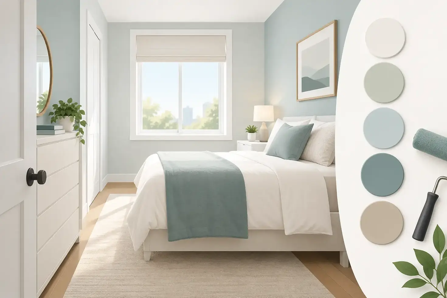
Best Paint Colors for Small Rooms That Feel Bigger

A small room does not need a dramatic color to make an impression. In fact, the best paint colors for small rooms usually do their work quietly: they reflect available light, soften visual boundaries, and create a feeling of continuity from wall to wall. The right choice can make a compact guest room, hallway, office, or bathroom feel more comfortable without pretending the space is larger than it is.
For Prescott homeowners, color selection also needs to account for strong Arizona sunlight, changing daylight throughout the day, and the warm, natural materials common in local homes. A sample that looks airy in a paint store can look stark under bright afternoon sun. That is why color is best chosen in the room itself, alongside the flooring, trim, furnishings, and lighting that will remain after the painters leave.
What Makes a Small Room Feel Larger?
Paint cannot move walls, but it can change how clearly the eye reads them. High-contrast colors tend to define every corner and edge, which can make a small room feel more enclosed. Colors with similar lightness on the walls, trim, ceiling, and major furnishings create fewer visual interruptions. The result is a room that feels calmer and more open.
Light reflectance matters, but pale paint is not the only answer. Very bright white can feel cold or glaring, especially in rooms with abundant sun or limited softness from textiles and furniture. A slightly warm off-white, a muted green, or a gentle blue-gray can provide the same open feeling with more character.
The most dependable approach is to choose a color that fits the room's light rather than choosing a color simply because it is labeled "small-space friendly." North-facing rooms often need warmth. South- and west-facing rooms can usually handle cooler or more neutral tones because the sunlight already brings visual warmth.
Best Paint Colors for Small Rooms
Warm off-whites for flexible, bright spaces
Warm off-whites are often the safest choice when a homeowner wants a room to feel larger while keeping it inviting. Look for whites with soft beige, cream, or subtle greige undertones rather than a sharp blue-white cast. These shades work particularly well in small living rooms, bedrooms, hallways, and spaces with wood floors or tan stone finishes.
The trade-off is that off-white walls can look plain if every surface is also white. Add depth through natural wood, darker hardware, textured bedding, artwork, or a slightly deeper trim color. The room remains open, but it does not feel unfinished.
Light greige for a polished, grounded look
Greige sits between gray and beige, making it a practical option for homeowners who want a clean neutral without the coolness of traditional gray. A light greige can make a small room feel organized and refined while working with both warm and cool accents.
This color family is especially useful in homes where adjacent rooms already have beige carpet, oak cabinetry, or stone details. Instead of fighting those fixed finishes, greige bridges them. Choose a lighter version in a room with little natural light, since deeper greige can become muddy in shadowed corners.
Soft blue-gray for calm bedrooms and bathrooms
A muted blue-gray can visually recede, which helps walls feel less close. It is a strong choice for a small bedroom, bathroom, or home office where the goal is calm rather than brightness alone. In Prescott homes with intense warm daylight, the cool undertone can also create a welcome balance.
Avoid colors that are too icy or saturated unless the room receives plenty of warm sunlight. In a dark room, a blue-gray that looks sophisticated on a paint card may read as flat and chilly. Pair it with warm white trim, brushed brass, wood tones, or soft ivory fabrics to keep the space comfortable.
Muted sage and eucalyptus greens
Soft, grayed greens have become a favorite for small rooms because they offer personality without the visual weight of a deep forest green. Sage, eucalyptus, and pale olive shades connect naturally with desert-inspired palettes, wood furniture, and black or bronze accents.
These colors work best when they are muted rather than bright. A yellow-green can feel lively, but it may dominate a small space. A gentle gray-green has more flexibility and can make a powder room, laundry room, or guest bedroom feel intentional and well designed.
Blush, clay, and soft warm neutrals
Small rooms do not have to be cool-toned to feel open. Pale blush, muted clay, and warm sand colors can create a soft glow, particularly in rooms with limited direct sunlight. These shades are more forgiving than stark white and can make a compact room feel welcoming at night under lamps.
The key is restraint. Choose a dusty, softened version rather than a bright peach or orange. A warm neutral should support the room's light, not overwhelm it.
Should You Paint a Small Room Dark?
Yes, but only when you want intimacy more than an expanded feeling. A deep charcoal, navy, olive, or moody brown can make a small powder room, den, or bedroom feel tailored and memorable. Dark colors blur the edges of a room, especially when used on the walls, trim, and sometimes ceiling in the same color family.
This approach is less forgiving in rooms that lack lighting or have cluttered layouts. Dark walls can highlight a bright white ceiling, crowded shelving, or mismatched trim. It works best when the room has a clear purpose, a few thoughtfully chosen furnishings, and layered lighting.
For homeowners who love a dark shade but are unsure about using it everywhere, consider it for a compact bathroom, a single accent wall, or built-in cabinetry. A professional color consultation can help determine whether the room will feel cozy or simply closed in.
Paint Finish Matters as Much as Color
Even the right color can disappoint if the finish is wrong. Flat or matte paint hides minor wall imperfections and creates a soft, even look. It is often a good choice for bedrooms, ceilings, and lower-traffic rooms. However, it is less washable than other finishes.
Eggshell is a reliable middle ground for living areas, hallways, and bedrooms. It provides a small amount of sheen, is easier to clean, and does not call attention to every bump in the wall. Satin is usually the better choice for bathrooms, kitchens, laundry rooms, and trim because it stands up better to moisture and frequent cleaning.
Higher sheen paints reflect more light, but that does not automatically make a room look bigger. Too much shine can expose drywall flaws and create distracting glare in sunny spaces. Quality preparation and the appropriate finish matter as much as selecting a popular color.
Use the Ceiling and Trim to Create Continuity
A bright white ceiling can make a standard-height room feel taller, especially when the wall color is light. But white is not the only option. Painting the ceiling a lighter version of the wall color can create a softer transition, which is useful in small bedrooms and rooms with uneven lighting.
For a more immersive look, paint the walls, trim, doors, and ceiling in closely related tones. This minimizes contrast lines and can make the room feel more cohesive. It is particularly effective in narrow hallways, small offices, and powder rooms.
If your trim is in good condition and already a warm white, do not choose a cool white wall color without testing it first. Undertone conflicts are one of the most common reasons a freshly painted room feels "off" even when the individual colors looked good separately.
Test Colors Before You Commit
Paint samples should be viewed on more than one wall and at more than one time of day. Apply a large sample, or paint a movable board, then look at it in morning light, afternoon sun, and evening artificial light. A color near a window can look completely different from the same color on an interior wall.
Also test alongside permanent finishes. Flooring, countertops, tile, cabinets, and fireplace stone have undertones that will not change. Your wall color needs to work with them, not compete for attention.
At Pronghorn Painting, color-selection support is part of making the painting process less stressful. A clear plan before work begins helps prevent costly changes, keeps the project on schedule, and gives homeowners confidence that the finished room will feel right.
The best choice is the color that supports how you want to use the room. Whether that means a warm off-white that brightens a guest bedroom or a deep green that gives a powder room real presence, a thoughtful sample test and careful preparation will make the finished space feel intentional for years to come.


Comments